

Trending News
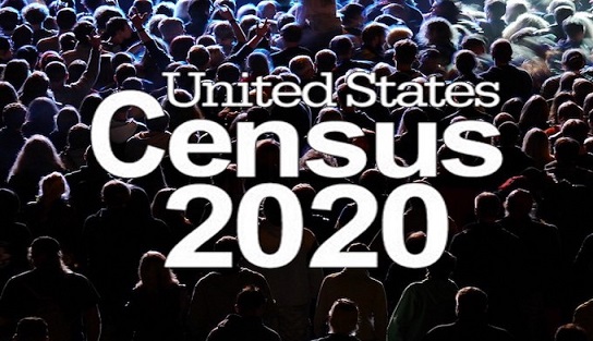
Census 2020 Response Rates - Interactive Map
What's the self-response rate in your city? Will 2020 surpass 2010?
Over the last year, this newsletter has featured a few articles on the importance of the decennial census. From a community indicator perspective, data collected during Census 2020 will be the foundation for estimates until 2030. Ultimately the decennial census is the largest data source for Spokane Trends, both directly (population, educational attainment, etc.) and indirectly (per capita figures such as gross domestic product, personal income and taxable retail sales).
The Census 2020 Response Rates interactive map shows in real-time Census 2020 response rates for the nation, all 50 states (and Puerto Rico), every Congressional District in the U.S. Further, this interactive includes cities (even small cities such as Deer Park, Medical Lake, Rockford, and Waverly) tribal areas, and census tracts. Zoom in on Washington State (or any point on the map) for greater detail.
Before March 20, 2020, the interactive will show the self-response rate of Census 2010. On March 20, it will switch to show the self-response rate for Census 2020.
Households considered self-responders are those receiving their census form through the mail or dropped off by a Census worker. These processes will begin in time for most households to receive their census forms between March 12th and 20th. The self-response rate includes all unduplicated online, regular mail, and phone responses of an area, while excluding any nonresponse follow-ups. No adjustment is made for vacant homes or undeliverable addresses.
Don’t forget to check Census 2020 Response Rates map in the following weeks and months as the numbers get closer to, but never achieving 100%. The national self-response rate during Census 2010 was 74%, with only twenty cities larger than 100,000 residents self-responding at 80% or higher. The army of Bureau of Census workers on the ground are following-up with non-responding households.
For those interested in the tracking any differences of the self-response rates of Census 2010 and 2020 on this website, here were final self-response rates for Census 2010 in the following locations:
- Spokane County was 70.4%
- The City of Spokane was 72.3%.
- The City of Spokane Valley was 72.3%.
- Airway Heights was 58.1%.
- Medical Lake was 68.6%.
- Cheney was 64.3%.
- Spangle was 50.0%.
- Waverly was 61.2%.
- Latah was 26.7%.
- Rockford was 70.5%.
- Fairfield was 72.0%.
- Liberty Lake was 63.6%.
- Deer Park was 64.7%.
---------
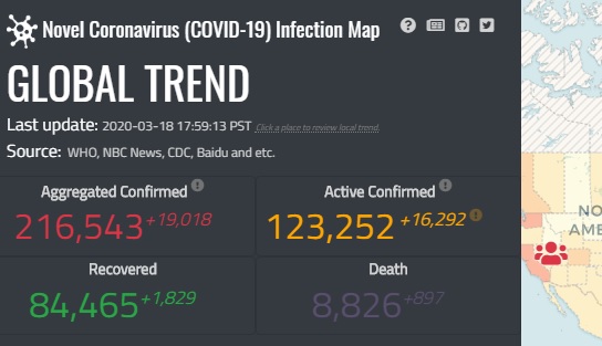
COVID-19 Interactive Map by Bo Zhao, UW
Showing "where and how many people are infected" with COVID-19
With new confirmed cases of Novel Coronavirus (COVID-19) growing each day, it’s not easy keeping track of what’s happening very near us, in the state, across the nation, and around the globe.
Designed specifically to measure “where and how many people are infected”, the Novel Coronavirus (COVID-19) Infection Map, by University of Washington geographer Bo Zhao, uses data from local, county, state, and U.S. Centers for Disease Control and Prevention (CDC) as the source for the U.S. Data for the global view come from the World Health Organization (WHO) and various governmental agencies in countries around the world.
For things you can do to best protect yourself and your family, we suggest state and county health departments, and the CDC. Knowing the number and location of confirmed COVID-19 cases may or may not be comforting, but either way, you know its reliable, from quality sources, updated every few hours.
Starting with a global view, zoom in on the U.S. and Washington State for greater detail as to the location of confirmed COVID-19 cases. This works for any location in the U.S.
For a deeper look at the global situation, click on the “Situational Heat Map” tab just below the graph on the left side of the webpage, you can easily see what other countries are experiencing in a thumbnail graph showing the difference between the aggregated confirmed and active confirmed cases of COVID-19. Click on a country and see even more detail, including recoveries and deaths starting with Jan 21st.
While fighting a COVID-19 pandemic is more important than anything on Spokane Trends, they do compare if only in the sense good data, released in a timely manner, allows for informed decision-making.
---------
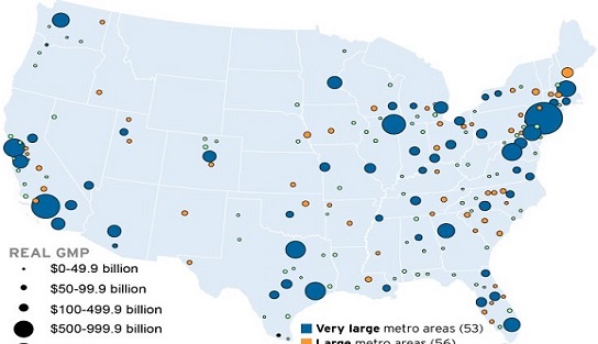
The Brookings Metro Monitor 2020
Looking beyond GDP and jobs for economic performance indicators
According to Brookings Institute, “The nation’s GDP has grown in every quarter since the middle of 2009, and the labor market has added jobs in every month since September 2010. However, GDP and job growth on their own are not sufficient markers of economic health.”
In general the Brookings Metro Monitor 2020 found growth, prosperity and overall inclusion in Very Large metro areas at higher rates than Large and Midsize metro areas. How did the Spokane-Spokane Valley Metro Area, which combines Spokane, Pend Oreille, and Stevens Counties score? First, a brief explanation about Brooking’s method.
Metro Monitor Key performance indicators are:
- Growth: measuring total jobs, Gross Metropolitan Product (GMP), and number of jobs at young firms;
- Prosperity: measuring productivity, average annual wage, and the standard of living;
- Inclusion: measuring employment rate, median earnings, and the relative poverty rate;
- Racial Inclusion: measuring employment rate gap of white people and people of color, median earnings of white people and people of color, and the relative poverty rate of white people and people of color;
- Geographic Inclusion: measuring employment rate gap of the top and bottom neighborhoods, median household income in the top and bottom neighborhoods, and the relative poverty rate of the top and bottom neighborhoods.
The three different metro classes by population are:
- Very large: populations of more than 1 million residents;
- Large : 500,000 - 1 million residents - the Spokane-Spokane Valley metro area was here with an estimated 559,891 residents during 2018;
- Midsized : 250,000 - 500,000 residents.
Two different time periods were considered:
- 1-year: 2017-2018 reflecting recent changes;
- 10-years: 2008-2018 reflecting changes since the Great Recession.
Not wanting to give everything away, instead we’ll report growth or decline in key performance indicators for each time period.
The 1-year time period for the Spokane-Spokane Valley metro area primarily showed growth while the 10-year time period showed a split between key performance indicators growing and declining.
After you’ve had a look, keep scrolling down and two additional dashboards are available allowing for a direct comparison of any single indicator to any five metro areas in a line graph or map view.
Trends In Action
Spokane Is Not a Magnet for Immigrants
by Dr. Patrick Jones
With the notable exception of Native Americans, immigrants have defined the history of this country. Distinct waves of people coming from somewhere else started in the early 1600s and continue to this day. Yet, Spokane’s Lady Liberty doesn’t seem to hold the same appeal for the foreign-born as other parts of the U.S. do.
As indicator 0.2.2 reveals, immigrants to the county have climbed over the past decade. In 2008, Census estimated that over 23,000 Spokane County residents were born in other countries; by 2018, this number stood at approximately 28,500. The two shades of the bar depict whether the foreign-born have become U.S. citizens or not.
Yet the indicator also reveals that the share of the county population accounted for by the foreign-born, naturalized or not, remains far below the shares of the U.S. and Washington state. For 2018, the total foreign-born share here was estimated to be 5.5%. While that represents a slight increase from 2008, it is statistically not significant. The U.S. share in 2018 was 13.7%, and for Washington, higher yet, at 14.6%.
Actually, Spokane is an anomaly east of the Cascades. Shares of the foreign-born in the metro areas of Eastern Washington are considerably larger. For both the Tri Cities and the greater Wenatchee area, the demographic made up a little more than 15% of total population in 2018. Yakima County’s estimated share in 2018 was over 19%. And Grant County’s estimate for 2018 stood at over 20%.
The profile of immigrants in Spokane County departs from that of the U.S. and Washington in another way: a majority of the foreign-born now report that they are U.S. citizens. For the U.S., the percentages are identical. But for Washington state, considerably more foreign-born are not citizens than those who are. So while not attracting nearly as many people from overseas, Spokane appears to assimilate them more readily.
Another measure of immigration, indicator 0.2.5, Share of the Population Not Speaking English at Home, corroborates the findings of the foreign-born. In 2018, Census estimated that about 7.5% of the residents in Spokane County did not use English as the primary language in the home; this is largely unchanged from 2010. Contrast this estimate to that of the U.S. – about 22%, and that of Washington State, at 20%. Here the gap is slightly larger between Spokane and the benchmarks than for the foreign-born. This might give further evidence to the notion that the assimilation rate here is higher than elsewhere in the U.S. Or, it could be that the county attracts foreign-born who are already English speakers at a slightly higher rate.
Why might this community lag so far behind the U.S. and the state in attracting the foreign-born? There are several possible explanations. For one, there is little need for agricultural labor in the county. The orchards, vineyards and field crops of central Washington have long attracted migrant labor, many of whom have become permanent residents, if not citizens. This type of agriculture doesn’t exist in Spokane.
Another reason lies in the middle size of Spokane. As a metro statistical area (MSA), it now ranks 100th in the U.S. But it is the biggest of the MSAs that have typically attracted the largest numbers of immigrants. William Frey, long-time demographer at the Brookings Institute, recently wrote about the changing patterns of immigration in the U.S. Among the ten largest MSAs, foreign-born shares in 2018 ranged from 11% (Philadelphia) to 41% (Miami-Ft. Lauderdale). Among the next ten largest MSAs, these shares range from 5% (St. Louis) to 31% (San Francisco). With four exceptions, all 20 of the country’s largest MSAs showed immigrant shares higher than the national average. Clearly, immigrants prefer cities, actually metropolises.
Another reason for Spokane’s tepid growth of immigrants undoubtedly lies in the region’s relatively slow economy over the past few years. The Frey study also ranks MSAs by an immigrant growth rate over the period 2010-2018. Those in top ten, which include the Seattle-Tacoma-Bellevue MSA, increased full- and part-time jobs by a cumulative average of 29%. Job growth in the U.S. was 18% over the same period, and in the Spokane MSA, which includes Pend Oreille and Stevens Counties, 15%. While familial connections count in the choice of landing spot for immigrants, job prospects probably play at least as important a role.
Other factors have undoubtedly influenced Spokane’s weak draw for immigrants. It would be great to hear readers’ thoughts on this.
What might the next five years show for the County? It seems clear that the larger forces pushing international in-migration upward will not strengthen appreciably. As Frey notes, the year-over-year increase in 2018 of immigrants to the U.S. was the lowest in since 2008. The decline of immigrant growth was in place before the Trump administration, but its actions against legal and illegal immigration has certainly helped to depress the numbers even lower.
On the other hand, the same report points out that the states where foreign-born shares have gained the most are non-traditional landing spots for immigrants, such as North and South Dakota (115% and 58% gains from 2010 to 2018, respectively), Idaho and Utah, among others. Spokane has had more culturally in common with these inland states than the western metro areas of Washington, Oregon and California. Couple this trend with the recent increase of the pace of job creation in Spokane, and the next 3-5 years might well see more international diversity in our schools and churches and on storefront signs.
---------
Why Crime is Not Easy to Measure and How Crime Data is Affected by More than Crime
by Scott Richter and Dr. Patrick Jones
Crime statistics are not like other statistics found on Spokane Trends. First, to better their odds of “getting away with it”, most perpetrators will do their best to cover their tracks given enough time. It could be a simple as waiting in the shadows to make sure no one will see the crime take place, casing a joint, or even running away from the scene.
Consider if other data, such as per capita personal income (PCPI) or taxable retail sales, were collected the same way as crime data. It would take the PCPI or Retail Sales Police actively seeking out this information, and relying on the community to report income or retail sales numbers not for themselves or their businesses, but for random people and businesses they just happen to interact with for a few moments. Therefore, crime statistics are inevitably lower than the true frequency of crime.
The comparison is corny, but the substance of it is real. The FBI estimates during 2018, total collective financial loss to property crime victims in the U.S. was $46.4 billion.
The Federal Bureau of Investigation measures crime throughout the nation in the Uniform Crime Reporting (UCR) program. The UCR measures seven broadly defined crimes: four violent (murder-non-negligent manslaughter, rape, robbery, and aggravated assault) and three property crimes. While property crimes are considered less severe than violent crimes, they occur at a much greater frequency and are more likely to not be reported to law enforcement.
As defined by the U.S. Department of Justice, UCR property crimes include:
- Burglary - “the unlawful entry of a structure to commit a felony or theft.”
- Theft / Larceny - (excludes motor vehicle theft) “the unlawful taking, carrying, leading, or riding away of property from the possession or constructive possession of another.”
- Motor Vehicle Theft - “the theft or attempted theft of a motor vehicle.”
While the UCR is broad enough to provide a national standard, it has limitations. First, during a multi-crime event, only the most serious crime is counted. Example: someone badly physically assaults you and steals your car, just the assault is counted. Second, the UCR counts only crimes known to law enforcement. Unless law enforcement witnesses a crime, or discover new crimes while investigating others, someone must report a crime.
In Spokane County, the two most common ways for people report crimes are by calling 9-1-1 (when a crime is in-progress), or Crime Check 509-456-2233 to report anything regarding crimes that previously occurred. crimes not in-progress, to report crimes or new information about previously occurred.
The UCR does not include drug crimes, simple assault, weapons violations, counterfeiting, or human . Other crime reporting systems, such as the National Incident-Based Reporting System (NIBRS) do. NIBRS measures over 50 different crimes in three categories and will replace the UCR in 2021.
Law enforcement agencies in Washington State use NIBRS and report their crime statistics to the Washington Association of Sheriff’s and Police Chiefs (WASPC). WASPC then collectively reports all crime data collected by all law enforcement agencies in the state to the UCR. For comparison, UCR and NIBRS crimes are listed here (pgs. 2 & 3).
Looking at the Total Property Crimes indicator on Spokane Trends, at first glance, we can observe that 2018 was sort of a middle-year for property crimes. The rate per 1,000 residents has been traditionally higher than the state and U.S. benchmarks and this relationship continued through 2018. In Spokane County overall, 47.1 property crimes were known to law enforcement compared to 29.9 in the state and 22.0 nationally.
The breakdown for 2018 reveals 18,080 larcenies / thefts, increasing by 59, or by 1.45% from 2017. Burglaries and motor vehicle theft were both down from 2017 and lower than their averages from the start of the series in 1995. More specifically, there were:
- 3,477 burglaries, decreasing by 301, or by 7.97% from 2017. From 1995-2018, the average annual number of burglaries was 4,777.
- 2,376 motor vehicle thefts, decreasing by 157, or by 6.20% from 2017. From 1995-2018, the average annual number of motor vehicle thefts was 2,423.
While true law enforcement simply can’t show in person or investigate every incident reported, they track type and frequency of crimes so they can respond accordingly where it’s occurring most often. This is the reason law enforcement agencies, including those in Spokane County, want people to report crimes they are aware of to create a more accurate view than if fewer people reported.
This influences crime statistics too. Just as an example, if actual crime stayed the same but more people are reporting than during previous years, an increased number of crimes will be known to law enforcement. So, statistically crime increased, yet actual stayed the same. What if the opposite occurred where fewer people reported crimes?
A Spokesman-Review article dated October 3, 2005 describes when major changes occurred to well-known ways residents could report crimes, including changing the phone number and reducing from a 24/7 service to 12-hours during weekdays, 9-hours on Saturday’s, and no service on Sunday’s.
The result, at least statistically, were significant decreases apparent in the middle of the Property Crimes graph on Spokane Trends. But, did actual crime go down? Not likely, and perhaps arguably even created an environment better suited for criminal activity. What happened statistically from 2004 to 2005 per 1,000 residents in:
- Spokane County was a decrease 18.5 from 62.6 to 44.1.
- Washington State was an increase of 0.3 from 48.5 to 48.8.
- The U.S. was a decrease of 0.8 from 35.2 to 34.4.
More specifically in Spokane County: larcenies dropped from 19,020 to 12,660 (-33.4%); motor vehicle theft increased from 2,680 to 2,697 (+0.6%); burglaries dropped from 5,323 to 3,952 (-25.8%). It then took four or five-years for crime statistics to get back up to the same levels as before Crime Check was eliminated.
While crime statistics are important, by nature they cannot be definitive, but this doesn’t mean they are subjective. Safety, on the other hand, is subjective since people living in the same neighborhood, city, or county will respond differently based on personal perceptions and experiences.
---------
High School Extended Graduation Rates: It’s About More Than Just A Diploma and Spokane Continues to Outperform
by Brian Kennedy and Dr. Patrick Jones
$16,337. That is the difference between the 2018 median earnings of an individual without a high school diploma and the median earnings of all individuals in the United States according the U.S. Census. That difference extrapolated across the entire working years (ages 18 to 65) would account for a lifetime difference in earnings of nearly $800,000.
Different outcomes are not just in economics either. Educational attainment has been linked to health outcomes as well. A study looking at the life expectancy of the OECD nations (largely made of North American and European nations) states that “people with the highest level of education live around six years longer than people with the lowest level of education.”
Given how impactful a high school diploma is on an individual’s life, we should take it as a point of pride that not only has been steadily increasing here, but Spokane County’s graduation rates are continually outperforming the state for both on-time and extended (those graduating within five years) graduation rates. The idea of an extended graduation is to include those students who may need an extra year to finish out all high school requirements. The Office of Superintendent of Public Instruction (OSPI) states that while the 4-year cohort will still be the baseline, the extended or 5-year cohort measure is more inclusive, and “the outcomes for more student groups will be included in determining which schools need support.” Given this position by our state’s public education agency, indicator 3.3.4 displays the 5-year extended graduation rate.
By the 2018-2019 school year, Spokane County was sitting at an extended graduation rate of 85.5%, 5.1 percentage points higher than the start of the trend in 2010-2011. While the state rate has been growing as well, the County is still 1.7 percentage points higher than the state’s.
Driving the much of the improvement has been the County’s largest district, Spokane School District. In 2010-2011, the extended graduation rate in the Spokane School District was just 75.4%. In less than a decade, the district rate has improved by 14.6 percentage points to where it sits now, at 90%.
However, it’s not just Spokane School District that is doing well. A majority of the school districts are outperforming the state, from Central Valley at 89.7% to Cheney at 87.7%. In fact, Nine Mile Falls School District, with an extended graduation rate of 96.8%, ranked number one in the state for the 2018-2019 school year, with Deer Park sitting at fourth. Across all 193 school districts across the state, where data are available, Spokane County has three in the top 25 (Mead ranking 24th).
These rates are truly something to be proud of in our community; nonetheless, it is important to look to where there is room for improvement. All students face the challenges of completing homework and passing tests, but there are certain socioeconomic groups that face obstacles outside the classroom, affecting their ability to succeed within the classroom. Bigger concerns of wondering where you might be sleeping tonight, when you might be eating next, or struggles with language barriers can all impact student performance. Indicator 3.3.5 tracks the extended graduation rate for low income and homeless students, while indicator 3.3.6 tracks the rates for the non-white population to show where some of these disparities can arise.
In 2018-2019, low-income students in the County had a five-year graduation rate of 78.1%. While this is 2.1 percentage points higher than their state counterparts, low-income students’ rate is 7.4 percentage points lower than the overall rate. Even worse off are homeless students, as defined by the McKinney-Vento law. There are about 3,000 countywide, and their five-year graduation rate is 67.8%. This is 8.1 percentage points higher than the state but over 17 percentage points lower than the overall County rate.
While not nearly as marked as for low-income and homeless students, there are clear differences when extended graduation rates for racial and ethnic minorities and the overall rate. Non-white students in Spokane County are graduating a rate nearly 10 percentage points higher than the state average, sitting at 82.8% in 2018-2019. However, non-whites are falling behind slightly their non-white counterparts here, who have a rate of 86.3%, by 3.5 percentage points. The positive note here is that these struggles are not near as pronounced as they are throughout the rest of the state where a difference of 12.3 percentage points exists between these two groups. So while there is room for improvement, the County’s districts and their students are outperforming the state yet again.
Graduating high school isn’t just about getting a diploma. There are long-term impacts to the economic and social well-being of our residents. Moreover, as trends go in Spokane County, the extended graduation rate is one our community can celebrate. While there is always room for improvement, consistently outperforming the state, showing continued improvement, and having the top ranked school district is the state is something we should be proud of.