

Trending News
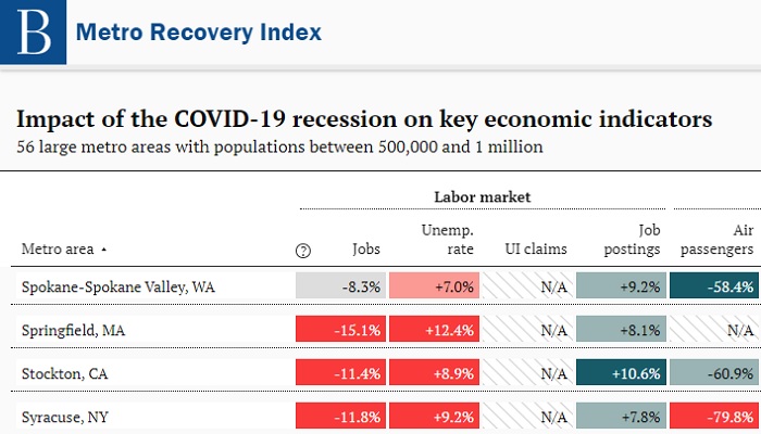
Brookings Institute: Metro Recovery Index
Measuring the impacts of the COVID-19 recession and the road to recovery differ widely across local economies
by Trends Staff
The Metro Recovery Index, offered by Brookings Institute, was created because the “…impacts of the COVID-19 recession and the road to recovery differ widely across local economies.”
The Index presents this information in two different main views: “At a Glance” and a dashboard.
“At a Glance” offers a side-by-side view of metro areas with a similar population size. Filter by:
- Recession Impact, using a pre-covid, or “pre-crisis” baseline.
- Current Trajectory, using trends over the last month as baseline.
And by population sizes:
- Very Large, more than 1 million, such as the Portland-Vancouver-Hillsboro, OR-WA and the Seattle-Tacoma-Bellevue, WA metro areas.
- Large (between 500k & 1 million), such as the Spokane-Spokane Valley, WA and Boise, ID metro areas.
- Midsized (250k-500k) such as the Kennewick-Richland, WA and the Olympia-Lacey-Tumwater, WA metro areas.
The Spokane-Spokane Valley, WA metro area, comprised of Pend Oreille County, Spokane County, and Stevens County, is considered a Large metro area based on the estimated population of just over 580,000.
The dashboard is located below the “At a Glance” section. Here, select from the same metro areas, but the key economic indicators provide much greater detail than the side-by-side comparison in the “At a Glance” view. The dashboard also shows very recent data, such as each month of 2020, or over the six previous quarters.
Key economic indicators used in the Brookings Metro Recovery Index:
- By Labor Market aspects (number of jobs, unemployment rate, weekly unemployment claims, and unique job postings).
- By Economic Activity aspects (number of passengers, mobility to workplaces, volume of hours worked at small businesses, and small business closings).
- By Real Estate aspects (number of active listings, median list price, commercial property vacancies, and average rent paid at multi-family properties).
---------
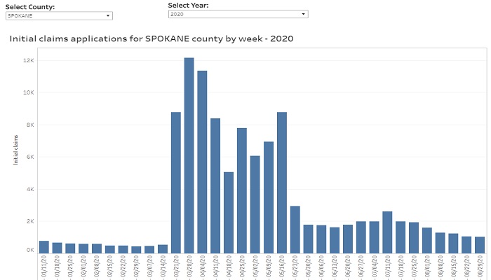
Unemployment Insurance Initial Claims Weekly Dashboard
Initial claim totals, by supersector (state) and 3-digit NAICS industry sector (by county)
by Trends Staff
In the United States during 2020, numbers for both job creation and job losses have been in the millions and tens-of-millions. While both are part of the economic impact of COVID-19, the national unemployment rate reached 14.7% during April, 2020.
According to the U.S. Bureau of Labor Statistics, 14.7% is the highest rate since January, 1948, using these methods.
Since April, job growth has also been unprecedented, such as the 4.8 million added nationally during July, 2020 and the 1.4 million during August, 2020.
National figures are important, but most workers are limited to employment within proximity to where they live.
The Washington State Employment Security Department, Labor Market and Economic Analysis has created a new data interactive with helpful information for each county and for the state overall.
There are four main tabs: weekly initial claims (state), initial claims by industry supersector (state), initial claims by county, and county initial claims by industry sector (3-digit NAICS).
The interactive begins on the first tab showing a weekly view of the overall total initial unemployment insurance claims in Washington State. The second tab drills into these data showing initial unemployment insurance claims within 21 industry sectors, such as healthcare & social assistance, manufacturing, retail trade, construction, and mining.
The third and fourth tabs offer similar views, but for counties in Washington State.
The overall total initial unemployment insurance claims by county mirrors the tab for the state showing overall total initial claims. The fourth tab shows initial claims for unemployment insurance, on a weekly basis, in over 90 industry subsector categories, for every county in the state, for both 2019 and 2020 YTD.
Keep checking back as this interactive updates each week.
---------
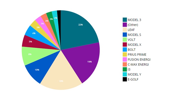
Electric Vehicles in Washington State: Access Washington – data.wa.gov
Currently registered vehicles by vehicle type and by county
by Trends Staff
When something is the first, there is no need to put a number after it – until there is more than one. Examples include the modern Olympic Games, movies with a sequel, and the Sony PlayStation.
The same can be said for an Industrial Revolution. While the term has somewhat come to represent the sum of human technology and advancement, there have been three separate Industrial Revolutions throughout history. Some argue we are currently in “Industry 4.0”, or the Fourth Industrial Revolution where cyber / internet is advancing allowing our physical, digital, and biological worlds to swirl and blend together.
While we do know cyber / internet has changed society, we will leave this for future historians to consider.
If we are living in Industry 4.0, this era will continue to produce inventions changing our lives and future generations. Inventions driving humanity forward, for better or worse, such as the internal combustion engine, electric engine, jet engine, and the internet search engine.
A few years ago, owners of electric cars could drive very limited distances from home – or at least within proximity to electrical outlets. As the number of electric vehicles increases, demand for a new infrastructure, charging stations, also increases. For hybrid vehicles (those using both gas and electricity) this is much less of a concern.
Today, Washington State has developed a significant electric vehicle charging infrastructure, including being part of the West Coast Electric Highway. This has literally opened the road for electric vehicles, generating new public and private investment to continue building the electric vehicle charging infrastructure across Washington State.
Eventually “gas-burners” will go the way of the dinosaur, but not overnight. Knowing the number of electric vehicles on the road is helpful, but a specific location helps investors know where increasing the charging infrastructure is needed most.
Further, knowing the exact type of electric vehicle popular in a specific location might shed light on a community’s commitment to electric vehicles by purchasing more of them overall, or a larger percentage of high-end models than elsewhere in the state.
Data.wa.gov has created a new data visualization showing all currently registered Battery Electric Vehicles (BEVs) and Plug-in Hybrid Electric Vehicles (PHEVs) in the state. Filters include vehicle type (BEV and PHEV) and model, but also by county, city, and legislative district.
This information likely will not be part of a future Fourth Industrial Revolution conversation, but it can help both public and private entities make informed decisions now.
Trends In Action
Share of Jobs by Earning Range: Shifting in favor of higher wage occupations
by Brian Kennedy and Dr. Patrick Jones
Income distribution is an important topic to watch because it can shed light on a lot of different socio-economic topics within a community. Is there a large concentration of low wage occupations? Has there been a hollowing out of middle-class job opportunities? The measure can also be used to determine whether economic development efforts are effectively courting new industries that provide higher paying jobs. Whatever your motivation, looking at the breakdown of jobs by earnings range over time can be a tool to understand the local economy.
The Spokane metro area has long occupied an economic niche of a regional service provider to its largely rural surroundings in Eastern Washington and Northern Idaho. This niche is expressed in a labor force showing a strong backbone of education, government, healthcare, retail trade, and financial workers. As the area economy evolves, competitive and diverse wages are critical, not only for improving the lives of current residents but also for enticing new talent to relocate here. In Indicator 2.4.7 we can track how the share of jobs based on their earnings range have changed in the last few years.
The graph presented shows a breakdown of jobs by three earnings brackets; under $30,000, as this is a good measure that shows individuals working but essentially at the federal poverty line; $30,000 to $50,000 for those that are in the middle tier, falling just below the average annual wage in the region; and those jobs sitting above the average annual wage, at $50,000 or more.
Over the four years measured, the share of jobs paying under $30,000 has shifted down in the Spokane metro area. What might be driving this? Is the evidence pointing to wage increases among the lower earners or are businesses simply hiring more individuals in the upper earnings brackets? While it is likely that a little of both forces are at play, the data seem to lean on employment growth in high wage occupations.
The graph shown here incorporates employment levels in all occupations throughout the Spokane Metropolitan Statistical Area, or Spokane MSA, (comprised of not only Spokane County but also Pend Oreille and Stevens Counties) and segments them out by earnings range.
Over the past four years, one can observe that the shares of Spokane MSA jobs have been shifting away from the lowest paying occupations. In 2016, nearly one in three jobs (about 30%) held by area residents reported annual earnings of $30,000 or less. That was double the statewide average, at about 14%. Moving into the more recent data (2019), we can observe that share halved to just 11.8%, or roughly on in every 8 jobs. Mathematically, if one share is falling the others should be rising. Here we see that about two thirds of those jobs went to middle earnings bracket of $30,000 to $50,000, growing by about 30,000 jobs or eleven percentage points, and the reminding third went to the higher income bracket over $50,000, growing by nearly 20,000 or seven percentage points.
If jobs are shifting to the middle and upper end of the earnings spectrum, what is occurring? Is there substantial wage growth in the lower wage occupations pushing once lower earning individuals into the higher brackets or has there been higher employment growth in the upper end?
The graph reveals in fact, that there more jobs being added to the middle and upper earnings tiers. From 2016 to 2019 the compound annual growth rate for the number of jobs earning $30,000 to $50,000 was 8%. The metro area added a little more than 30,000 jobs in this pay range. Similarly, workers in the upper end grew by 7%, adding nearly 20,000 jobs. On the flip side, the number of jobs supporting annual earnings of less than $30,000 fell by a compound annual rate of 19% and contracted over 35,000 jobs.
It would appear that employment growth in the upper annual wage tier is main driver for the change over the past four years. Could it be, however, that within those occupations individuals are simply earning more in 2019 than in 2016 and that these higher wages are pushing jobs that once paid under $30,000 over the threshold into a new earnings bracket?
Comparing the weighted average of the earnings of all occupations within the three tiers between 2016 and 2019 provides some insights into what has transpired. While there was quite a lot of variation of earnings changes across the occupations, there was limited mobility within the earnings ranges. In 2016 the weighted average earnings for those jobs paying an annual average under $30,000 was $26,569. By 2019 that had only shifted up slightly to $27,749. This indicates that the number of jobs is still fairly concentrated on the upper end of the earnings bracket.
While the earnings for the lower wage professions were increasing modestly, the same can’t be said for the middle and higher earners. For those jobs in the $30,000 to $50,000 range, the weighted average of annual earnings was $38,521 in 2016. By 2019 that had fallen slightly to $37,089. Those earning over $50,000 did fall as well, but only ever so slightly from $73,592 to $72,945.
This seems counter to the trend happening on Indicator 2.1.4, which depicts the overall average annual wage. The graph illustrates that the overall average annual wage has continued to rise from 2016 to 2019, increasing by nearly $6,000 to just over $50,000. The conflicting trends of falling wages in the middle and upper tier occupations suggests that the number of additional jobs that have been added have fallen above the overall average wage but below the $72,945 upper bracket average. In fact, 8 of the top 10 growing occupations fell within this band earnings band. These occupations include jobs such as accountants and auditors, buying and purchasing agents, kindergarten teachers, carpenters, mobile heavy equipment mechanics, and other computer occupations.
So, what does that all mean and what do these comparisons show? They indicate that wages within the middle and upper tier occupations didn’t really show signs of increasing wages. If the weighted averages had shifted up one could infer that individuals in these occupations would have seen their earnings increase. Given that the share of employment in these earnings brackets increased but the earnings stayed relatively the same, implies a quantity response: more jobs were added in these earning brackets although they were paying similar wages as they were back in 2016.
Despite the evidence leaning towards employment growth in higher wage occupations with wages staying relatively stagnant across occupational data, this isn’t entirely bad news. As new jobs are added at higher wages, businesses will start to compete for workers, implying higher wages in the future.
Households Severely Challenged by Rental Costs Not Decreasing in Spokane
by Dr. Patrick Jones
At the end of every month, we always hope that there is a little money left in our bank accounts. For many, however, this is rare. For an unknown but likely significant segment of Spokane County’s population, end-of-month balances are often zero or negative.
At the most basic level, this predicament occurs when household costs exceed income. That balance can be due to low income, high living costs or some combination of both. Examining income flows is beyond the scope of this piece, but they are obviously highly important. Instead, we’ll consider household costs, and in particular housing costs. These typically make up the largest single component of a household’s budget. The Consumer Price Index (CPI), for example, places shelter costs (rent or owner-occupied) at 33% of the budget.
What happens then in housing greatly effects household finances. For families with children, childcare is also a large expense, but the category for most households doesn’t loom as large as shelter costs. Spokane Trends tracks housing costs in a couple different ways. In this look, we consider renters and in particular, those renters “severely challenged” by shelter costs (rent and utilities).
For decades, the U.S. Housing and Urban Development agency has set a threshold for shelter not to exceed 30% of income. If greater than this threshold, then shelter expenses do not leave enough to afford other basics of life, let alone any saving. For renters, Spokane Trends tracks this population via Indicator 6.2.2. As one can observe, by this measure many County renters find themselves in this situation; for 2018, Census estimated over 36,000, or nearly half of all renters. This group may include those renters barely spending more than 30% on shelter costs or those spending much more.
As a consequence, Census has developed a measure that tracks those renters “severely” challenged by shelter costs. Here the threshold is 50% of household income. Indicator 6.2.3 shows the recent results. As one can readily see, the number of County renters who found themselves in this category in 2018 was estimated at 18,000, or about half of the more encompassing measure. That translated into a share of renters of 24% of all renters.
One the main aims of Spokane Trends is to track progress over time. For this indicator, unfortunately, there hasn’t been as much progress since the start of the series in 2006. At 23.6% share, it was identical in 2018 to 20065. As the graph shows, in the ensuing years after 2006 the number of severely challenged renters rose by a small amount then fell by a small amount.
Why so little progress? That’s a big question, touching on both income growth and rent growth here. It’s worthwhile noting, however, that the shares of both Washington State and the U.S. show the same flat path. So this community isn’t too different than America writ large.
The Census offers a little more detail in other tables that helps understand Spokane’s standing. In a tabulation looking at rental shelter cost shares of income by age, at least two insights are available. This table cuts off the threshold of shelter costs at 35% of household income, so it is not directly comparable to Indicator 6.2.3. But is still offers insights.
The first concerns the very young renters, ages 15-24. The very young typically have considerably less income than older cohorts. Compared to the benchmarks, Spokane has a higher share of this age group renting: 14% vs. 10% for Washington and 9% for the U.S. Although the Spokane share of young renters spending 35% or more for shelter costs is smaller than those of the state or the U.S., the share of young renters spending 35% or more of their income on shelter cost out of all renters here is slightly higher than the U.S. and about the same for Washington State.
The second concerns senior renters, ages 65+. This age group is, as with the very young, associated with lower (often fixed) incomes. The share of Spokane renters in this age group of all renters is also a bit higher than the benchmarks: 17% here vs. 16% in the U.S. vs. 15% in Washington. Since the shares of all three geographies who pay 35% or more in shelter costs is essentially the same, the total share of seniors in this category out of all renters is slightly larger here than in the state or the U.S.
Another dimension to deciphering the reasons behind the number and share severely challenged renters likely lies with race and ethnicity. There is no readily available Census table that breaks out the challenged renters describe by race/ethnicity by the threshold of 50%. But one table allows us some insights.
It should come as no surprise that non-white households are more likely to be renters. Our county’s people of color simply do enjoy the same incomes as whites (non-Hispanics) do. For 2018, whites were estimated to make up 79% of County renters while all non-whites (including Hispanics) made up 21%. The categorization is based on the head of the household's ethnicity. As Indicator 0.2.3 demonstrates, the non-white share of the county population in 2018 was estimated to be 15%. So 21% of the renter population is made up by groups that, county-wide, comprise 15% of the population.
Another source behind Spokane’s halting progress in reducing the share of the severely rent-challenged may lie with families headed by a single parent. In most cases, these families have low incomes; in most cases, it is also likely that they are renters. And, as Indicator 0.3.4 reveals, the share in 2018 was little changed from 2006 for Spokane families headed by a single parent.
That’s three likely groups of renters who do not enjoy high incomes. Their shares of the population have grown or stayed much the same as a decade ago, helping to keep the size of the severely rent challenged population largely unchanged. There are undoubtedly more contributors to the lack of progress in reducing the severely shelter-cost challenged.
How do 18,000 Spokane renters make ends meet? For students, it could well be mom and dad. For others, however, the burden must be crushing. What will the repercussions of COVID-19 foretell for this measure? We won’t know for at least a year. Let us hope that the any uptick in the numbers is minimal. Given COVID-19’s impact on the local economy, however, that might be wishful thinking.
Decreasing Food Insecurity Over Last Decade: Facing new challenges due to COVID-19
by Scott Richter and Dr. Patrick Jones
The COVID-19 pandemic has brought on many new challenges, with no place on the globe unaffected. Getting the right treatment to patients, not to mention case tracking, not to mention developing a vaccine have been huge challenges. Making sure everyone has the basic requirements of food, shelter, and clothing has been challenged too.
The United Nations World Food Programme recently doubled their estimates of acutely food insecure people in the world, from 135 million to 265 million globally. The earlier estimate came from a report before the pandemic listing “…conflict, the effects of climate change, and economic crises.” as the primary causes.
The UNICEF definition of acute food insecurity is “when a person’s inability to consume adequate food puts their lives or livelihoods in immediate danger.” It is more severe than the food insecurity faced in the U.S.
A recent Brookings report using the COVID Impact Survey showing initial impacts of COVID-19 has concluded the pandemic has greatly increased food insecurity in the U.S. The Brookings report shows food insecurity during 2018 the U.S. was at or near 20-year lows. By April 2020, food insecurity for mothers with children 0-12 and households with children 0-17 more than doubled from the 2018 estimates. Food insecurity for all households nearly doubled while mothers with children 0-12 who were not eating enough because they could not afford it more than tripled.
It seems longer than just 5-months ago, but by April of this year, many places across the U.S. had already entered quarantine. In-class instruction for public schools had been suspended, millions if not tens of millions of jobs were lost, and people who still had jobs were either working from home or were considered essential often in workplaces such as healthcare, food processing, and agriculture with an increased risk of contracting coronavirus. As we know now, April 2020 was just the beginning of a long pandemic and the negative impact on the food insecure population could already be more negatively impacted than the Brookings report indicated in April.
Feeding America defines hunger as “a personal, physical sensation of discomfort” and food insecurity as “a lack of available financial resources for food”.
Feeding America uses the U.S. Department of Agriculture two-part definition of food insecurity:
- Low food security “reduced quality, variety, or desirability of diet. Little or no indication of reduced food intake.”
- Very low food security “multiple indications of disrupted eating patterns and reduced food intake.”
While it is too early to know what the current shares of Spokane County food insecurity look like, Feeding America recently released the 2014-2018 food insecurity estimates.
Looking at the Share of Population with Food Insecurity indicator on Spokane Trends, sourced by Feeding America, shows both the overall and youth populations in Spokane County were the lowest in the series starting with the 2005-2009 time period. Further, the overall and youth populations in Washington State and U.S. were also the lowest in the series during the 2014-2018 time frame.
More specifically, during the 2014-2018 time period, the share of the total population who experienced food insecurity during the past year in:
- Spokane County was 13.0%, and the youth population was 19.5%, decreasing from 15.5% and 25.2%, respectively, since the 2005-2009 time period.
- Washington State was 10.7%, and the youth population was 14.7%, decreasing from 14.8% and 24.7%, respectively, since the 2005-2009 time period.
- The U.S. was 11.5%, and the youth population was 15.2%, decreasing from 16.6% and 23.2%, respectively, since the 2005-2009 time period.
So while the share of the county population facing food insecurity has thankfully declined over the past decade, it remains higher than the benchmarks. Further, between the 2010-2014 and the 2011-2015 time periods, the state and U.S. benchmarks either continued or began a downward trend. While also showing decreasing trendlines, the shares of both the overall and youth populations of Spokane County have not experienced decreases at the same pace.
Each year, Feeding America calculates shares of the overall and youth populations struggling with food insecurity “to improve our understanding of food insecurity and food costs at the local level.” This year, in response to the pandemic, Feeding America created projections for 2020 showing what we are likely dealing with in the here-and-now.
However, these are unprecedented times. While more people are faced with food insecurity, community organizations are likely to face these new challenges with diminished resources to meet an increased demand.
The National Center for Biotechnology Information and the National Library of Medicine, National Institute of Health are warning “The COVID-19 pandemic complicates or even nullifies the complex strategies that families facing food insecurity use to feed themselves.”

Q1) Please tell the readers the main activities and current strategic goals of Lutheran Community Services Northwest (LCSNW)?
A1) All of the district offices of Lutheran Community Services Northwest partner with individuals, families, and communities for health justice and hope. In the Inland Northwest, we’ve zeroed in on trauma recovery.
We have child welfare programming that includes domestic foster care for children of all ages, unaccompanied refugee minor foster care for young people who have been permanently separated from their families of origin due to war, natural disaster, or illness, as well as Wraparound with Intensive Services (WISe) and Family Outreach Crisis Intervention Services (FOCIS).
We also offer free and confidential services to victims of crime and their loved ones through our Victim Advocacy Program. Victim Advocates (both paid and volunteer) answer our 24-hour crisis line (call or text 509-624-7273), and respond to area hospital emergency departments along with our Sexual Assault Nurse Examiner to provide healing, justice and plain old comfort during the forensic exam process.
We also help with both criminal and civil legal matters, school, employment and housing concerns, providing trauma-informed guidance through complicated systems. I’m skipping a lot here, but the beauty of this team is there responsiveness when it comes to new needs.
Finally, we have a large outpatient behavioral health program. The Sexual Assault & Family Trauma (SAFeT) Response Team is a large team of specialized clinicians, peer support specialists, and intake professionals working to address trauma caused by traumatic violence. The majority of our clients in this program are children, and many adults are refugees and immigrants.
Strategically, we’re working hard on improving the integration of our services across programs internally and externally, preventing violence, using technology to meet the needs of our community in new ways, and raising our voices to advocate for the needs of our clients and staff.
Q2) As the Inland Northwest Director of LCSNW, you must use some metrics to track the organization’s progress. Can you share them with us?
A2) There are many! Each service has a different measures of success. Of course, we measure the number of clients served and the number of hours of service clients receive. These are the nuts and bolts, and one indication of whether we’re making an impact. Depending on the type of service, we may be measuring whether we’ve connected with primary care doctors, whether symptoms have decreased, positive impacts in relationships or at work/school, how long a foster youth stayed in a stable placement, or even whether a victim felt believed. We have a spread sheet several pages long our Management Team and Quality Improvement team reviews and discusses monthly. It’s time well spent, and information is shared back to program teams from there. We all want to know whether what we’re doing is working, or whether we need to change course. Our smallest service area is designed to deter youth from behavioral health hospitalization. FOCIS has 1.5 FTEs dedicated to it, and a 100% success rate.
Q3) Among the 200+ indicators on Spokane Trends, which ones are the most relevant to your work here?
A3) Every one of them helps us understand our community. That’s the reason I periodically go through the site to remind myself of the many nuances and social determinants of health that need to be addressed for Spokane to be as successful as possible. That being said, I’m drawn first to the health and public safety indicators. As I mentioned above, we have programming specifically designed to prevent youth hospitalization and suicide. Thoughts of suicide are often preceded by childhood trauma. Seeing Spokane’s disproportionate rate of suicide was heartbreaking and I often reflect on it when setting goals for our organization. Addressing trauma really is a matter of life and death. Of course, reported abuse is also very critical to the work we do at LCS. Since oppression is at the root of trauma, racial equity and equity for people with disabilities, children and women are matters we watch. Additionally, we watch rates of violent crime, particularly sexual assault as we are a Certified Community Sexual Assault Program.
Having worked as an Intake Therapist at LCS for eleven years, I also have strong feelings about access to care. No matter how hard Spokane works, it seems we continue to struggle to reach all of those who need it, when they need it most.
Q4) As a long-time resident of Spokane, are there measures on the Trends that have personal interest? Have you been surprised by the path of any of these indicators over the past 10 years?
A4) I’m a bit of a nerd about this stuff, and find it all pretty interesting. I love my community and I’m proud to have made it home. All of your measures help people like me track our success and vitality.
Q5) You’ve been in non-profit leadership for many years. For decades non-profits have run on appeals that are largely qualitative in nature. Do you see any greater use of data to inform issues addressed by non-profits? Have you experienced organizations other than LCSNW step up their use of data in decision-making?
A5) I honestly believe people want both qualitative and quantitative data. We all have a drive for human connection, and for that reason stories connect us in ways that data never could. However, no one wants to feel as though the money, time or talent they donate to a cause is going to waste. Evidence of our efficacy is probably just as crucial for our supporters as it is for us internally. Communicating them requires balance.