

Small Area Health Insurance Estimates (SAHIE)
Data produced new each year, representing a snapshot in time
by Trends Staff
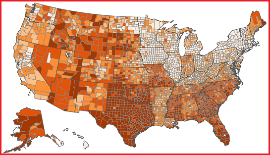
It is not often we can share two data interactives in the same article, in fact, this is the first time. Both are products of the U.S. Census Bureau, and both show data from the Small Area Health Insurance Estimates (SAHIE) from the mid-200’s through 2019.
SAHIE are “model-based estimates of health insurance coverage” produced every year and only apply to an individual year. Each year, SAHIE is individualized for all 50 states and nearly every county in the U.S. and stand as “the only source of single-year health insurance coverage estimates.”
In both interactives, Census defines “rate” as the share of a given population under the age of 65 lacking health insurance.
The first interactive has limited ways to engage, so hit the little play button and watch the county colors change throughout recent years as the share of the of the map. Essentially, this map will be green and yellow when uninsured rates are generally on the lower side. When the color is more of a blue, the uninsured rates are generally higher – and the darker the blue, the higher the uninsured rate.
SAHIE does include breakdowns for 5 or more age groups, 6 income categories, and for the states only, 4 race / ethnicity categories. The second interactive is a filterable dashboard to switch between insured and uninsured rates, between counties and states, and by age groups, race, and sex. The year can also be changed, but you will have to manually do this – no play button in this interactive.
This interactive provides a state comparison section where each state is represented as a different colored line with the rates and confidence intervals for 2006 through 2019. A table view offers estimated population numbers, as well as original and updated views due to SAHIE incorporating Medicaid enrollment beginning in 2016 and subsequently updating previous years data to also include these data.